R E S E A R C H @ H K U S T
35
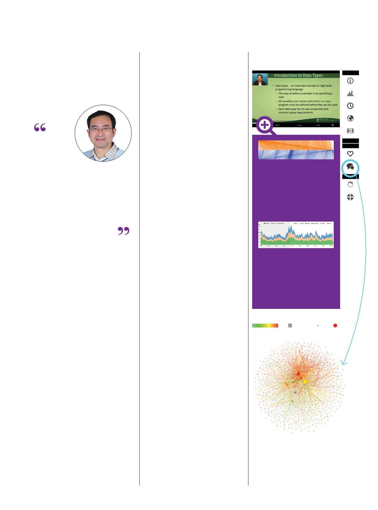
Dashboard
Course Info
Popularity Info
Age Info
Animation
Overview
Correlation
Demographic
Info
Sentiment
Analysis
SocialNetwork
Course
Video
Peak
Forum
Student’s grade
15
100 No grade
Student’s activeness
Less More
Forum Social Network:
each dot represents
a student. The size indicates the degree of
activeness, and the color indicates the grade.
The large gray dot shows that the student is
active in the forum but does not achieve any
score. The visualization gives valuable insight
about students and their learning interactions,
and provides MOOC instructors with useful
information to improve course content.
Seeing the Larger Picture
The power of the visual to impart informa-
tion plays a hugely significant part in our
lives, shaping our understanding of the
world through “seeing with our own eyes”
and through a variety of media, ranging
from art over the ages to today’s selfies
and YouTube videos. Prof Huamin Qu and
his team are leveraging such visual impact
to mine the digital world of big data, by
combining computational power to detect
patterns and extract information from
vast quantities of data with cutting-edge
graphics and virtual reality techniques. In
this way, they are uncovering previously
unknown relationships, including those
related to our own behavior. “We call it
amplifying cognition,” Prof Qu said.
One recent outcome of such data
visualization is VisMOOC, the first visual
analysis system for discerning e-learning
behavior. The intuitive HKUST web app
offers fine-grained analysis of video
“clickstream” data, drawn from learners
watching lectures for Massive Open
Online Courses (MOOCs). VisMOOC
pinpoints where learners play a section
multiple times (indicating difficulty in
comprehension), where they pause (to
consider or take notes) and what they
skip through (lack of interest or not
challenging enough), among other details.
Such clickstream data are matched with
statistics from chat groups (forums),
demographics, and grading for assignments
and exams. Results are then provided in a
novel visual form, labeleda “seekdiagram”.
Following VisMOOC’s success, Prof
Qu’s team and collaborators are developing
an open source platform with advanced
visualization interfaces for individual
institutions to do detailed analysis on
e-learning behavior and course design.
On a wider scale, Prof Qu is inte-
grating cutting-edge visualization with
large-scale telecommunications data to
create applications contributing to smart
city understanding, for example, route
planning, crowd management for
transportation, analysis of visitor traffic
for shopping centers at different times
of the day, and even tracking of disease
outbreaks. In 2016, such work saw Prof
Qu receive the Distinguished Collaborator
Award from Huawei’s Noah’s Ark Lab,
the company’s long-term, big-impact
research lab. Working with WeChat,
Mainland China’s dominant messenger
app, Prof Qu has also solved the
challenging problem of visualizing the
propagation of information over a large
social media network, involving multiple
attributes/dimensions and dynamic
evolution. Analyzing users’ behavior can
assist in finding common communication
patterns adopted by the public.
According to Prof Qu, a good
visualization design must be effective in
serving as a magnifying glass for what
the data patterns show, aesthetic and
intuitive. In addition, it should not be a
pie chart or bar graph but a new visual
form that carries interest for the viewer.
Such integration of computational power
in pattern recognition and mining and
human expertise in visual pattern
recognition, is a key area for further
exploration, he noted. “Many real-world
problems cannot be easily formulated as
a computer algorithm so we need to keep
humans in the loop.”
All these
charts and
visuals are like
a movie. The actors
are the same, but
when you combine them
together differently,
you can tell a new story
PROF HUAMIN QU
Professor of Computer Science
and Engineering
Seek Graph:
orange lines are forward
seeks, indicating that students skipped
certain parts of the video; blue lines
are backward seeks, meaning students
went back to watch sections of
the video. The thick blue lines indicate
video sections watched multiple
times, possibly to gain content clarity,
thus alerting instructors to evaluate
the course content and delivery.
Event Graph:
showing six different
types of clickstream data - play,
pause, sought, rate change, stalled,
and error - of the same course during
the same time period but for students
from different countries. By filtering
demographic info on the dashboard,
instructors can explore and compare
online learning behaviors
internationally.
Visual Analysis for Massive Open
Online Courses (MOOCs)


